Most of you probably know that some Gmail theme designs can change based on certain things, like time of day. Something you might not know (I didn’t) is that the theme options screen actually tells you this. In those tiny theme preview icons.
The fact that someone had to explain this to me, then we both had to GOOGLE for more details, tells me that this icon is not intuitive for the average user (given our small sample size). I couldn’t even find an explanation of these mysterious images on Google…ANYWHERE.
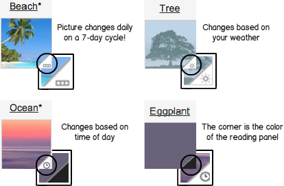
So here, at long last, is the (most) authoritative explanation of Gmail-theme-icon-image-corner definitions:
Some designer certainly spent some time thinking hard about this design problem. I imagine a conversation like this.
Engineer: Some themes change based on certain factors
Designer: Like?
Engineer: Day, time of day, weather…stuff like that.
Designer: We should explain that to the user when they’re choosing themes.
Engineer: Yes.
This led to a round of soul-searching by the Google design team. How do we find the balance between icon uniformity and utility? How can we scale this so that the same design paradigm can apply to every icon submitted by a theme developer? Do we have to combine two images on-the-fly?
Thinking about the purpose of the icon, someone stated that the icons exist to give the user a preview of what the theme would look like in real life. The room goes silent.
The team arrived at having a small triangle on the lower-right hand corner of the theme icon. This triangle would serve multiple purposes. First, it would explain to the user what color the reading panel is. Second, it will be used as a container whenever the theme is dynamic, meaning it changes on the time of day, weather, or any other factor. Within the container a small image will convey to the user if the theme changes, and if so what factor determines the change (weather, time of day, rotation of photos).
These designers deserve to have their story told and to get credit where credit is due. This was a well thought design; highly logical and defendable. The images in the corner tell the user if the theme changes based on time of day, weather, or a rotating set of photos. And on top of that — the corner color conveys to the user what color the background on the reading panel will be! A double doozie, promotions all around.
BUT IT’S TOO SMALL

